31 YEARS CELEBRATING THE POWER OF IDEAS
-
SELECT WINNERS YEAR
- Home
- |
- Back to LIA Main Home
Corporate Name of Client: Maharashtra Dyslexia Association
Head of Client Services: Kate Currawalla
Agency: McCann Worldgroup, Mumbai
Chief Creative Officer: Prasoon Joshi
Executive Creative Director: Pradyumna Chauhan
Group Creative Director: Subramani Ramachandran
Creative Director: Sharmad Khambekar
Associate Creative Directors: Pranav Bhide/Archit Gadiyar
Copywriters: Aakar Jain/Sharmad Khambekar/Archit Gadiyar/Pranav Bhide
Art Directors: Pranav Bhide/Apurva Muranjan/Sharmad Khambekar
Agency Producer: Robert Joseph
Design Director: Pranav Bhide
Designer: Pranav Bhide
Graphic Designer: Pranav Bhide
Retouchers: Nitin Sawant/Nagesh Mithbowkar
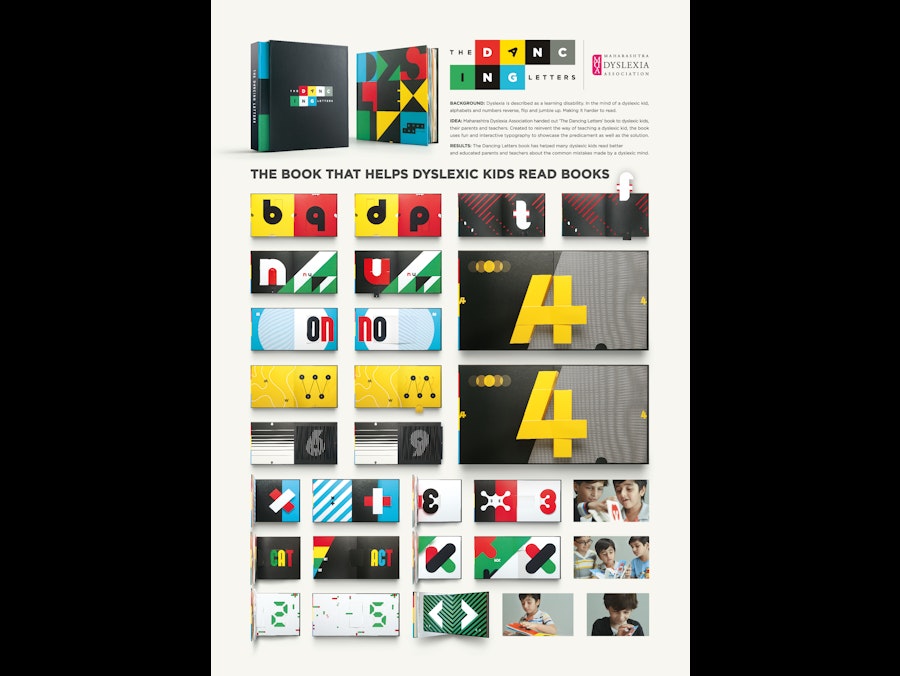
Background:
Dyslexia is described as a learning disability where kids have trouble with readability and comprehension in language. In the mind of a dyslexic kid, alphabets and numbers reverse, flip, mirror and jumble up. As a result, even familiar words become difficult to read.
Idea:
Maharashtra Dyslexia Association handed out 'The Dancing Letters’ book to dyslexic kids, their parents and teachers. Created to reinvent the way of teaching a dyslexic kid, the book illustrates the common reversals, making it easier for him/her to distinguish between similar looking alphabets, words and symbols. In 15 unique and engaging ways, the book uses fun, interactive pop-up typography to showcase the predicament as well as the solution to kids, parents and teachers.
Strategy:
Some kids learn fast, a few others have dyslexia. Dyslexia isn’t the inability to read. A dyslexic mind just learns differently, a fact not known to many. It's also a fact that dyslexic kids learn fast with multi-sensory approach. This led us to pop-ups. The pop-up methodology not only enhances the visual experience but also gives an opportunity to interact with the medium itself. Pop-up transformation of similar looking letters helps a kid remember the difference and also demonstrates to teachers and parents what goes inside a dyslexic mind.
Execution:
Dyslexic kids learn better when a creative tool is used to teach them, so our design needed to excite them. Our book is based on pop-up methodology. Pop-ups helped us showcase the trickeries that go inside the mind of a dyslexic kid. We used this method to show how 'b' changed to 'd', 'n' to 'u' or 'A' to '4' etc. Multi-sensory techniques, bright colours and bold patterns were used not just to catch their attention but also help them remember better.
Result:
The Dancing Letters book has helped many dyslexic kids read and comprehend language better. In addition, the book educated parents and teachers about the common mistakes made by a dyslexic mind. It dispelled the misconception that dyslexia is a prediction of intelligence.