31 YEARS CELEBRATING THE POWER OF IDEAS
-
SELECT WINNERS YEAR
- Home
- |
- Back to LIA Main Home

Corporate Name of Client: Narita International Airport Corporation
Agency Account Director: Hironori Onozaki
Creative Director: Naoki Ito
Design Companies: NIKKEN SEKKEI/Ryohin Keikaku/PARTY
Designer: Chihiro Konno
Project Members: Wataru Tanaka/Takao Goto/Yasumasa Hongo/Naoko Yano/Nobuyuki Tanimoto
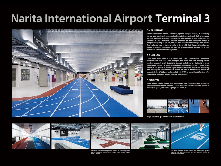
Narita International Airport Terminal 3, opened on April 8, 2015, it is exclusively for low-cost carriers. A construction budget of approximately half of the usual terminal meant no electronic signage and walkways or typical furnishings.
At Terminal 3, the maximum walking distance to the departure gates is comparatively long at 1.5 km, and the path features complex ups and downs.
The challenge was to communicate to the world that thoughtful design can overcome budget limitations as well as psychologically transform the user experience from stressful to enjoyable.
Due to costs, we could not to install the typical moving walkways or illuminated signs. Instead, to offer an exciting walking experience that is easy on the feet, we implemented running tracks used for track and field, and added signage for user-friendly guidance.
The key to the architecture and design is "more than 2 into 1." Consolidating two or more functionalities into one in pursuit of economic reasonability. In short, treasuring designs "with a twist without spending a lot of money."
Our solution was the concept of "more than 2 into 1" consolidating two or more functionalities into one.
- For example, instead of illuminated hanging signboards, we created large signs by securing tarpaulin sheets, which also heighten ventilation, to the pillars along the key wall traffic lines.
-The track-and-field running tracks function as user-friendly directional signage and stress alleviation for walking passengers.
- The blue running tracks signifying "departure" express the color of the sky and the uplifting feeling of traveling somewhere
- The earthy red running tracks signifying "arrival" represent the sense of relief when people finally land in Japan after a journey.
Observing how passengers spend extensive periods of time at the terminal due to the characteristics of LLC, we collaborated with MUJI to customize sofas that offer comfortable sitting as well as sleeping experiences.